A graphic designer communicates ideas and messages to the audience by combining ideas, images, and words. The basic building blocks of graphic design are its visual elements. They include colors, textures, images, shapes, typography, and lines that designers choose to use in their works. Such elements affect the final look, mood, and message of the design.
But there’s even more to a great design than the visual elements. The moment you decide what to include in your work, how to use it must also be decided. This is where the principles of design come in. They convey the relationship between the elements, their context, and the audience. Basic decisions you take regarding symmetry, hierarchy, and scale allow you to highlight certain text or image over others.
Such choices affect the legibility, accuracy, and coherence of your design in a big way. If you’re new to graphic design, you must certainly understand its five basic principles. For the success of your project, it’s necessary that you master them fully. These five basic principles are explained are:
1. Symmetry and Asymmetry
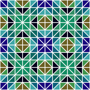
Let’s try to understand this principle with an activity. Take a design and draw a line through its center either from top to bottom or left to right. If each half mirrors the other half, the design has symmetry. Sides that are not the same can give the design an asymmetry.
However, it would have elements that are placed intuitively to give a sense of balance to the project. Your decision to choose symmetry or asymmetry must be made intentionally if you want your work to progress.
2. Scale
Instead of wondering how large or small something is, designers often consider scale in different terms. They look at it in terms of contrasting relationships and relative size between the visual elements. Designers can make a project visually appealing by including elements with different sizes and shapes. Sometimes, they also include relative size to convey information about the significance of one element over the other.
While creating a design, you must see how the size of one visual element relate to the other. You must also see how it relates to the frame or the page. It must also be seen how it relates to the audience. You can then express the message you want to convey visually.
3. Framing
Framing is used by designers to prioritize and emphasize key visual elements over others. It tells the audience where to look and features the most important aspects. Framing also defines key takeaways in a design. Along with the associated concepts, such as margins, bleeds, and crops, framing is also vital.
It makes sure that a design conveys the right ideas to the audience with short attention spans. Upon breaking a frame, the subject becomes so important or wild that it can’t be contained metaphorically. You may further narrow the focus of your audience if you add a second frame.
4. Hierarchy
Designers can make the information more orderly with the help of visual hierarchy. They use spatial cues like indents, line spacing, contrasting size, outdents, and color. This is done to emphasize important features and guide the audience in navigating complex content.
Projects would appear difficult to understand, unapproachable and messy without hierarchy. It is by mastering hierarchy that you can have clarity and impact in your design.
5. Grids
Grids are used by designers to provide structure to a layout. They give designers the opportunity to arrange elements evenly and size them appropriately. Rows, columns, margins, and space between blocks of text are often featured by grids. They maintain function and order in an image, which are the two fundamental attributes of an effective design.
